Wings for Limbs
The challenge
Wings for Limbs came to us at the very beginning — a new Oakville foundation with a mission as clear as it is human: to help amputees facing financial hardship get the prosthetic limbs that let them walk again. The hard part was never what to say. It was how to make a feeling visible. How do you give shape to hope, to dignity, to the quiet courage of starting over, without falling into the soft clichés that charity branding so often leans on? The foundation needed a brand that could carry real emotion and still feel calm, credible, and clear. Warm enough to move someone. Steady enough to be trusted.
The approach
We started before a single shape was drawn — with the mission, the vision, and the emotions the brand had to carry. We took the time to understand not only what the foundation does, but what it feels like to be the person it serves: someone at a hard turning point, who needs to be met with dignity, never pity.
Work like this rewards patience over speed. Before we designed anything, we let ourselves get close to the cause — sitting with the foundation's story, its people, and the lives behind it until we understood not just the brief, but what they truly wanted this brand to carry. We listened, asked, and listened again, holding every note of their feedback as direction rather than correction. The deeper we went into the why of Wings for Limbs, the more the design began to feel inevitable.
Hope, Compassion, Faith and Empowerment became the brief. Not words pinned to a moodboard, but the test every decision had to pass. The real challenge was balance — a brand warm enough to feel human, yet credible enough to earn trust; simple enough to read in a second, yet meaningful enough to hold a whole story. The name itself pointed the way: wings for limbs — lift, freedom, the possibility of moving through the world again.
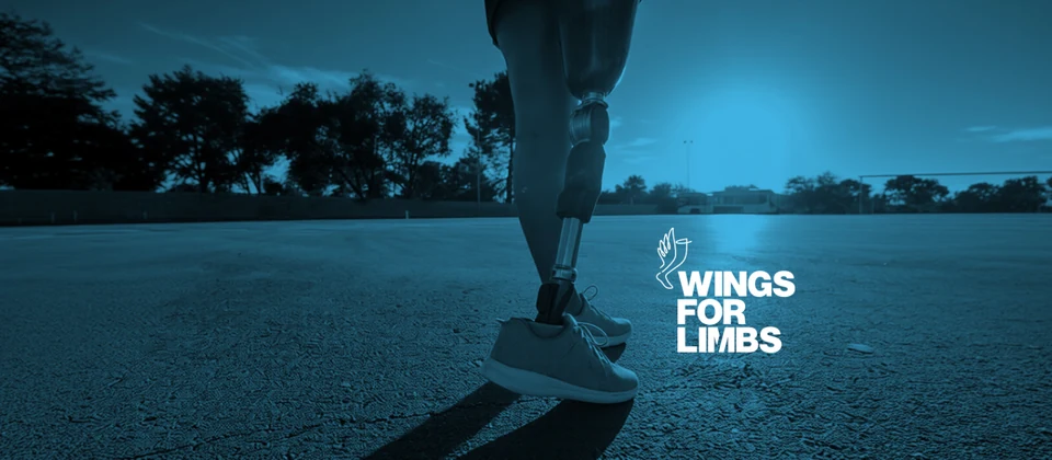
From there we built an identity on restraint. Nothing decorative, nothing loud. A logo that's clean and simple, yet warm and deeply human, with colour and symbolism chosen to say one thing before the brand ever speaks: that stepping forward is possible.
"From the very beginning, Muselevel took the time to truly understand our mission, vision, and the emotions we needed to convey — and transformed all of it into visuals, colours, and symbols that perfectly captured the story behind our nonprofit."
— Sonia Montañez, Wings for Limbs Foundation
The Result
What Wings for Limbs has now is a brand that feels like its mission — and for a foundation just finding its feet, that's no small thing. From its very first day it could show up looking established, trustworthy, and sure of itself, with an identity that holds together everywhere it appears: a logo, a palette, a visual language all speaking the same warm, dignified voice. For a young nonprofit, that kind of consistency isn't cosmetic — it's how a stranger decides to trust you. And a brand people trust is a brand people stand behind.
This was a pro bono project — part of a commitment we make every year to give our craft to a cause that deserves it. We do it because good design shouldn't be a privilege reserved for the organizations that can afford it. When a mission is this honest, and the people behind it are doing the real work, the least we can do is help it be seen — and make sure the first thing the world notices is the heart behind it.
"What impressed me most was their ability to create a brand that is clean and simple, yet warm and deeply meaningful — one that aligned with everything we stand for. They don't just create beautiful brands; they create brands with purpose and heart."
— Sonia Montañez, Wings for Limbs Foundation
A brand built to help someone step forward — made on purpose, down to the last detail.