Interlude
The challenge Interlude began as a question we wanted to answer on our own terms: what does a wine brand look like when every decision serves the bottle, and nothing is left to template? Most wine on the shelf falls into two camps — heritage labels leaning on centuries of cursive and crests, or loud disruptors shouting for the cart. We wanted a third register. A brand for the pause between things — the glass after work, before dinner, in the company of one or two people who matter. No occasion required.
As a self-initiated project, Interlude had no client brief and no budget ceiling. The only constraint was taste, which is harder than it sounds.
The approach
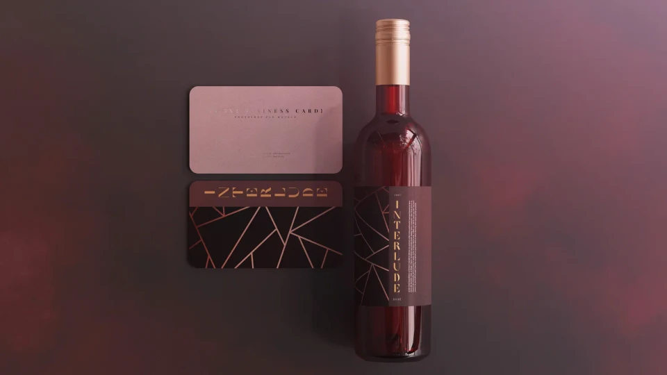
We started with the name. Interlude — the moment between acts. From there came the strategic core: a luxury brand that sells surrender instead of status. While the category promises control, sophistication, and achievement, Interlude says the opposite. Relax. Nothing is under control. Simply let it go. The campaign voice is a permission slip, not a flex — and in a shelf full of noise, calm is the loudest thing in the room. The identity centres on a custom condensed serif wordmark, etched in warm copper against deep oxblood, with fine geometric linework wrapping the bottle like a contour map that catches light at its edges. We rendered the entire system in 3D — controlling every reflection, every shadow, every pour — before a single physical sample existed. Then we placed it where the brand would actually live: a transit platform, an editorial spread, a lit corridor. Not advertising shouting for attention, but an object confident enough to be quiet in public. Strategy upstream, craft throughout. Every surface is designed to harmonize with every other, so Interlude reads as a real house from the first glance.
The outcome
Interlude is proof of register — a complete brand world built without a client to please, which is exactly why it shows what we do when we own every decision. Identity, packaging, 3D render, and out-of-home, all speaking the same low, deliberate voice. The web layer comes next: a single-page brand site that lets the bottle breathe and carries the same restraint online.
A brand for the pause. Built on purpose, down to the last reflection.